plotting example: plot_2d_boxes
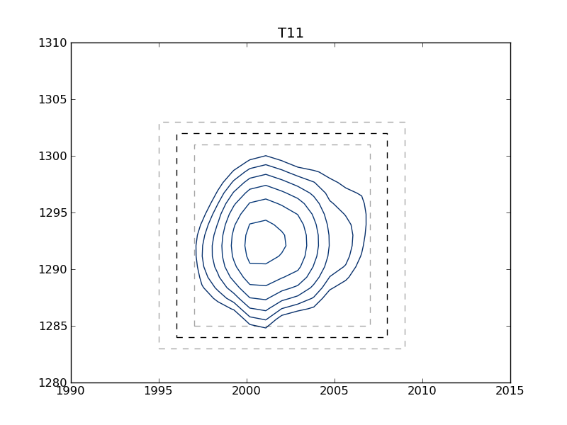
This example shows how to use nmrglue and matplotlib to create figures for examining data or publication. In this example the box limits used in integration example: integrate_2d are graphically examined. A contour plot of each peak is plotted with the box limits indicated by the dark dashed line. To check peak assignments see plotting example: plot_2d_assignments.
#! /usr/bin/env python
# Create contour plots of each peak defined in limits.in file

import nmrglue as ng
import numpy as np
import matplotlib.pyplot as plt
import matplotlib.cm

# plot parameters
xpad = 5    # padding around peak box on x-axis
ypad = 5    # padding around peak box on y-axis
cmap = matplotlib.cm.Blues_r    # contour map (colors to use for contours)
contour_start   = 30000     # contour level start value
contour_num     = 20        # number of contour levels
contour_factor  = 1.20      # scaling factor between contour levels

# calculate contour levels
cl = [contour_start*contour_factor**x for x in xrange(contour_num)]

# read in the data from a NMRPipe file
dic,data = ng.pipe.read("../../common_data/2d_pipe/test.ft2")

# read in the integration limits
peak_list = np.recfromtxt("limits.in")

# loop over the peaks
for name,x0,y0,x1,y1 in peak_list:

    if x0>x1:
        x0,x1 = x1,x0
    if y0>y1:
        y0,y1 = y1,y0

    # slice the data around the peak
    slice = data[y0-ypad:y1+1+ypad,x0-xpad:x1+1+xpad]

    # create the figure
    fig = plt.figure()
    ax = fig.add_subplot(111)

    # plot the contours
    print "Plotting:",name
    etup = (x0-xpad+1,x1+xpad-1,y0-ypad+1,y1+ypad-1)
    ax.contour(slice,cl,cmap=cmap,extent=etup)

    # draw a box around the peak
    ax.plot([x0,x1,x1,x0,x0],[y0,y0,y1,y1,y0],'k--')

    # draw light boxes at +/- one point
    ax.plot([x0-1,x1+1,x1+1,x0-1,x0-1],[y0-1,y0-1,y1+1,y1+1,y0-1],
            'k--',alpha=0.35)
    ax.plot([x0+1,x1-1,x1-1,x0+1,x0+1],[y0+1,y0+1,y1-1,y1-1,y0+1],
            'k--',alpha=0.35)

    # set the title
    ax.set_title(name)

    # save the figure
    fig.savefig(name+".png")
    del(fig)
#Peak   X0      Y0      X1      Y1
# Peak defines 15N resonance in 2D NCO spectra.
# Limits are in term of points from 0 to length-1.
# These can determined from nmrDraw by subtracting 1 from the X and Y
# values reported.
#Peak   X0      Y0      X1      Y1
T49     1992    1334    2003    1316
T11     1996    1302    2008    1284
# comments can appear anywhere in this file just start the line with #
G14     2032    1314    2044    1293
E15     2077    1025    2087    1004
W43     2008    952     2019    933
Sample Figure
[T11.png]